New visual identity for SMAG !
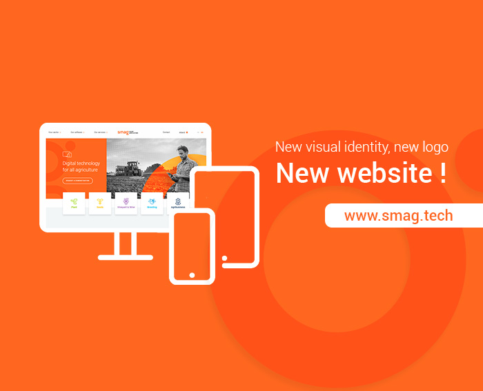
We’ve revamped our communication strategy! We have had a very productive summer with a complete revision of our graphic charter and our website. An opportunity for a revamp before for the autumn term begins !
SMAG has entered a new phase in its strategic development which will be put into practice at the end of the year with the launch of new operational management solutions that will be more intuitive, more mobile and will specifically incorporate the benefits of agricultural big data.
A new, more modern logo
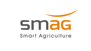
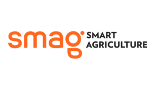
Our logo and our graphic charter have had a makeover – the beginning of this new step. Loyal to its original orange colour, our visual identity looks fresher and more modern thanks to a choice of zingy colours and rounder typography.
More modern, it is in step with our current dynamic and our determination to continually bolster the quality of our cloud-based offer.
 The minimalist emblem illustrating the letter G will eventually symbolise our brand and will be applied to our products little by little as a pictogram recogised by our user community.
A new world to discover on our stand B17 at the Innov-Agri Trade show (Outarville – from 4th to 6th September)
A redesigned website and a more streamlined communication
Our new website will launched on 3rd September and will also feature its new colours. Streamlined pages and content will make it easier to enhance user experience and access to information. To secure our position in the ecosystem of the SaaS agricoles software, a community blog “MySmag.tech” more centered on the buiding of a user network (specific articles for sectors, blog, tutorials, FAQ, user guides for our agreo, atland and lea software …) is expected at the end of the year.
The two websites were created by Choosit, a web agency in Montpellier, our trusted partner for seven years.
